

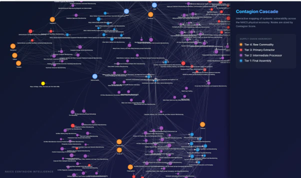
NAICS Contagion Map
Interactive mapping of the $1.1T physical economy blind spot
What is NAICS Contagion Map?
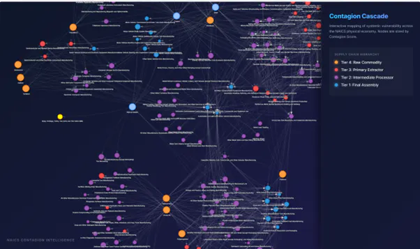
The NAICS Contagion Map is an open-source interactive tool bridging the $1.1T visibility gap between the physical economy and financial markets. While most models trade on financial data, the real world runs on manufacturing logic. Explore 346 nodes and 1,100+ relational edges in a physics-driven visualizer to trace systemic risk from Tier 4 (Raw Commodities) to Tier 1 (Final Suppliers). Identify anchor nodes and quantify contagion cascades. Free, open-source, and live on Hugging Face.
Screenshots
?
No comments yet. Be the first!
Real conversations about NAICS Contagion Map on X
Post on X